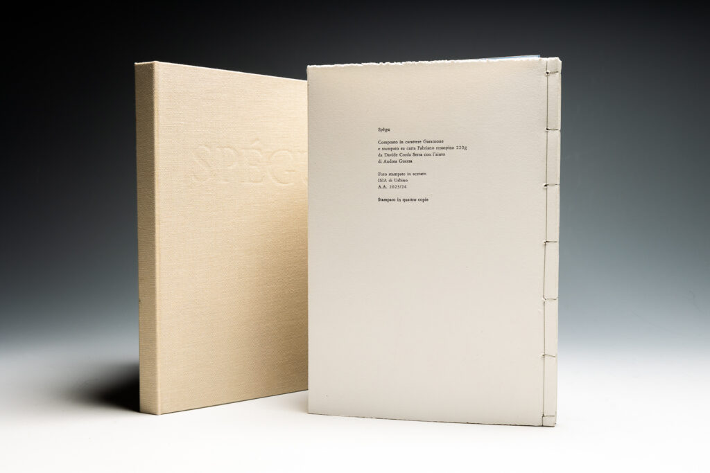
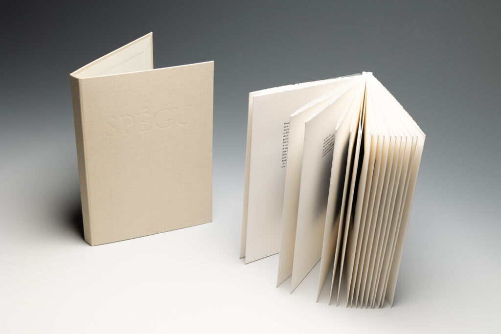
To reinforce the idea of the fragility of memory, the cover is detachable
(as if the book itself were falling apart), the ink is deliberately uneven,
and the debossing on the cover is barely visible, giving it a ghostly quality.
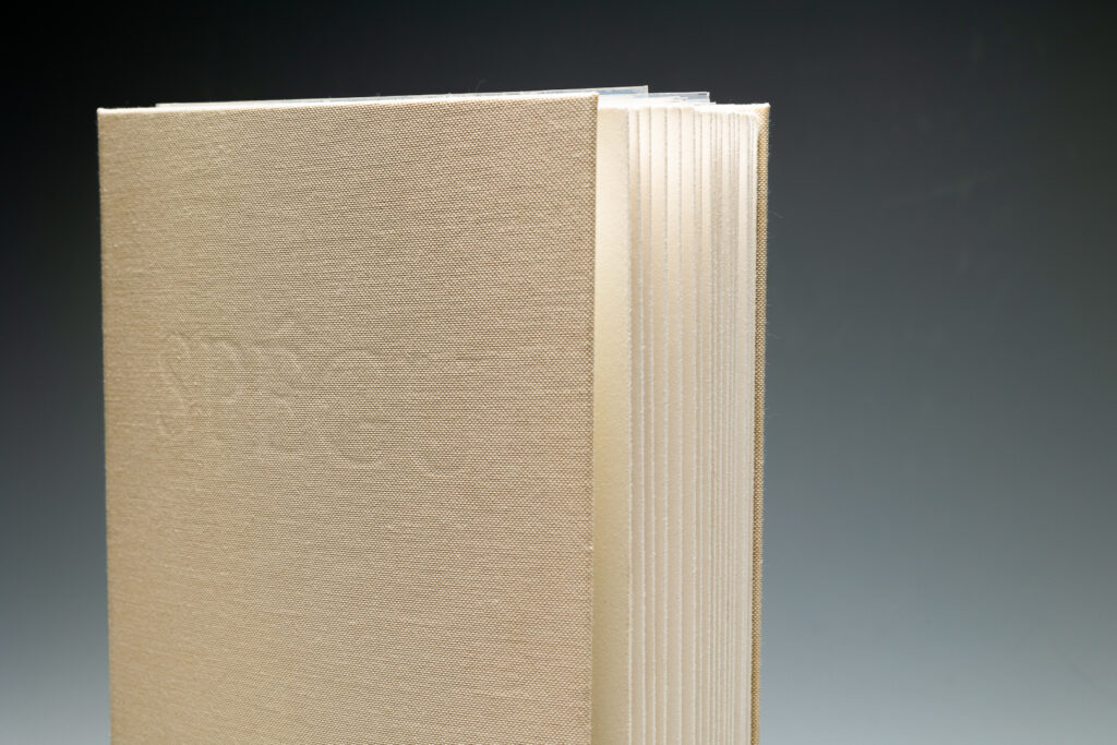
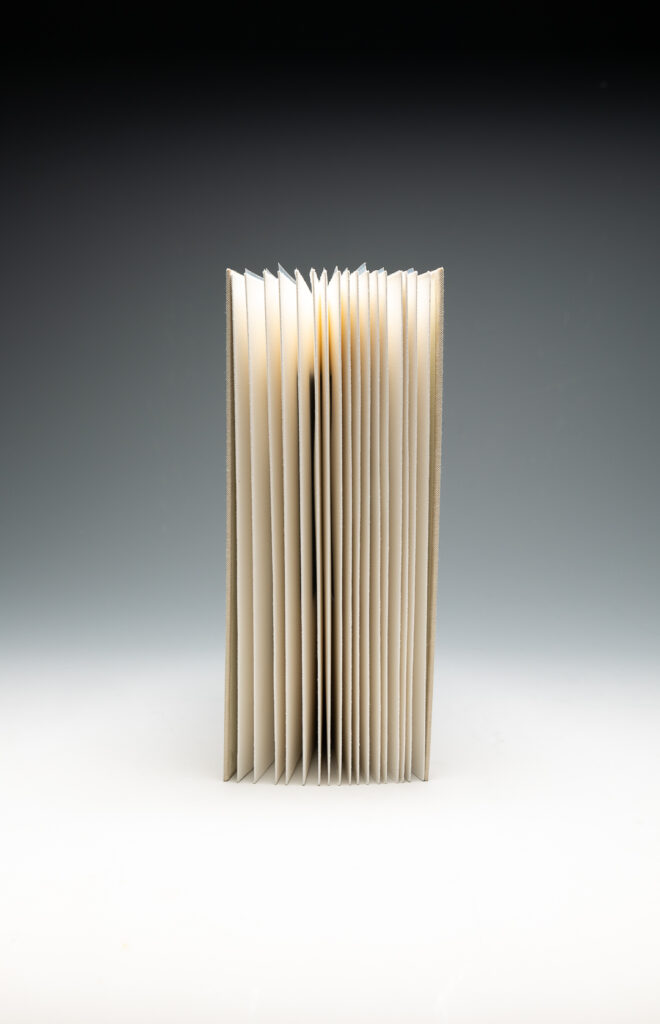
The thread used for the Japanese binding is grey, to simulate the absence of ink.
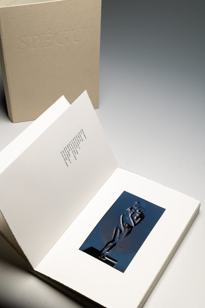
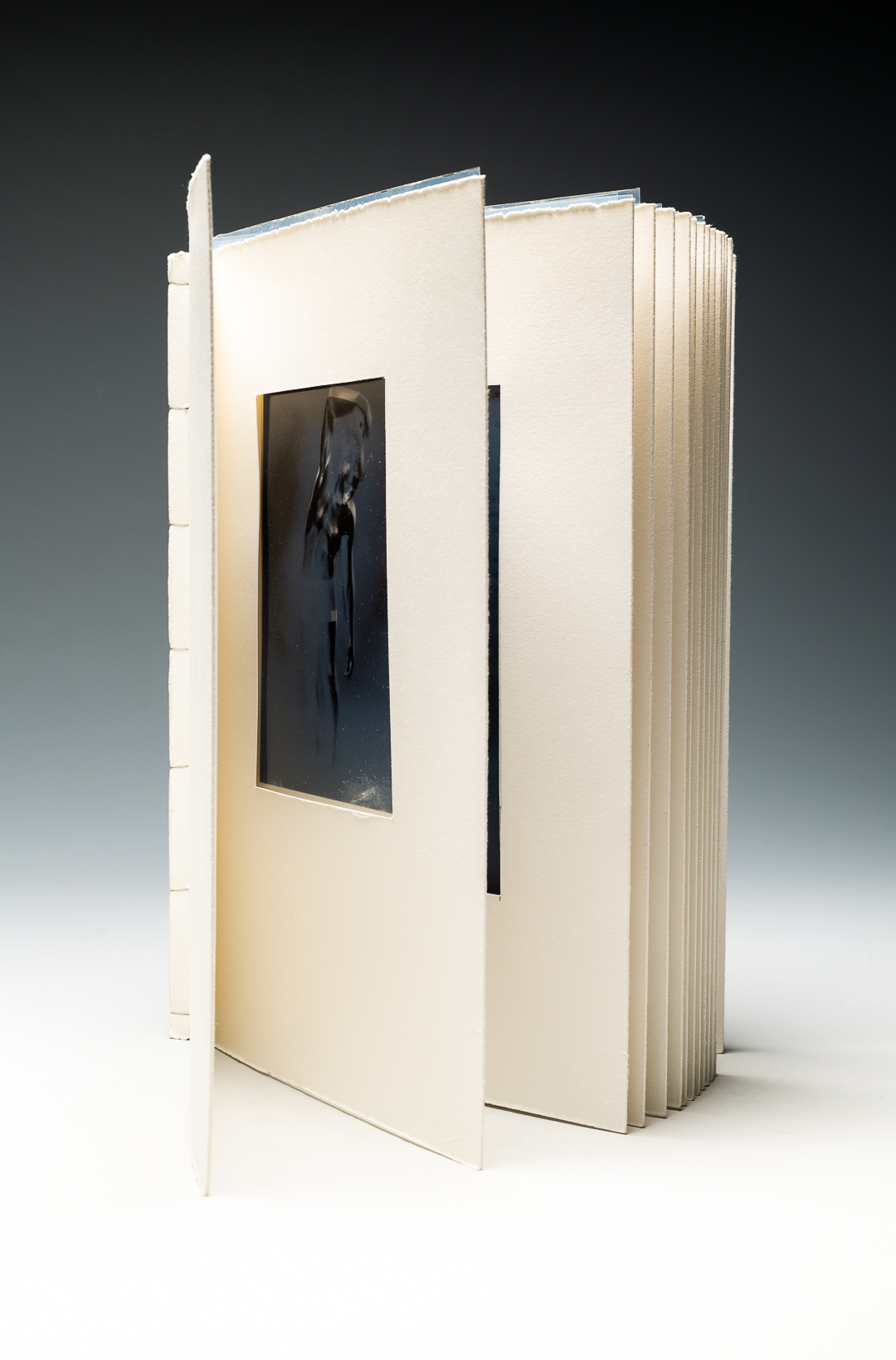
I chose an intaglio paper which I later roughened to create a tactile contrast
while reading the poems—rancorous in tone but softened by tenderness.
In the same way, the pages feel soft to the touch, but the rough edge adds a textured sensation.